Mathematics Study Guide for the HiSET Test
Page 5
Data Analysis/Probability/Statistics
Every time we turn around, someone is collecting data. The government collects data on population demographics, income, spending, and other aspects of the population’s lives. Companies collect data on shopping and traveling patterns. State Departments of Education collect data on student success (and failure). All of the data collected is analyzed for some purpose or outcome. If we understand data analysis, we have a better appreciation of what data can provide. Data can be presented in various forms, depending on the type of data collected.
Types of Data Presentation
Frequency distribution—A frequency distribution is a table showing how often each value of the variable in question occurs in a data set. We use a frequency table to summarize categorical or numerical data. This example shows how people travel most often, after taking a sample of \(150\) travelers.
\[\begin{array}{|c|c|c|} \hline \text{Method} & \text{Frequency} & \text{Percent} \\ \hline \text{Car} & \text{84} & \text{56} \\ \hline \text{Train} & \text{21} & \text{14} \\ \hline \text{Airplane} & \text{45} & \text{30} \\ \hline \end{array}\]Bar graph—A bar graph is a way of summarizing categorical data. It displays the data using rectangles, of the same width, each rectangle represents a particular category. Bar graphs can be displayed horizontally or vertically and they are usually drawn with a gap between the bars (rectangles).
Histogram—A histogram is a way of summarizing data that are measured on an interval scale (either discrete or continuous). It is used to illustrate the features of the distribution of the data in a convenient form.
Pie chart—A pie chart is used to display a set of categorical data. It is a circle, which is divided into sectors. Each sector represents a particular category. The area of each segment is proportional to the number of cases in that category.
Line graph—A line graph is useful to show the trend of a variable over time. Time is displayed on the horizontal axis (\(x\)-axis) and the variable is displayed on the vertical axis (\(y\)-axis).
Using Data
Once we have data, we can use the data to make estimates or predictions.
Example:
Given this frequency table:
\[\begin{array}{|c|c|c|} \hline \text{Method of Travel} & \text{Frequency} & \text{Percent} \\ \hline \text{car} & \text{84} & \text{56} \\ \hline \text{train} & \text{21} & \text{14} \\ \hline \text{airplane} & \text{45} & \text{30} \\ \hline \end{array}\]Use the table to estimate how many travelers would travel by car if the sample size is \(800.\)
Answer: \(448\)
Explanation:
Set up a proportion and solve it by cross multiplying.
\[\frac{84}{150} = \frac{x}{800};\;150x = 84 \cdot 800;\;x = 448\]Example:
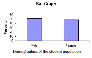
Given this bar graph:
If the college has \(34,000\) students, estimate the number of female students.
Answer: \(16,500\)
Explanation: It appears that the number of males is slightly higher than the number of females, although estimating might be a little inaccurate.
Example:
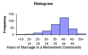
Given this histogram:
Estimate how many couples in the retirement community have been married between \(30\) and \(40\) years.
Answer: \(90\)
Explanation: It appears that about \(20\) couples were married from \(34 – 34\) years, and about \(70\) couples were married from \(35 – 39\) years, although estimating might be a little inaccurate.
Example:
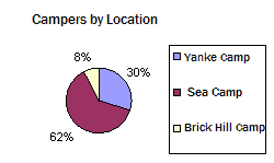
Given this pie chart:
If \(450\) campers came to the island during a specific month, estimate how many of the campers camped at Brick Hill.
Answer: \(36\)
Explanation: \(450 \cdot 0.08 = 36\)
Example:
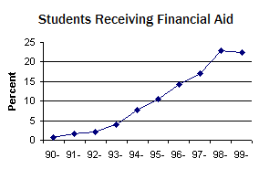
Given this line graph:
If the college had \(2,500\) students in \(1995,\) approximately how many of those students received some type of financial aid?
Answer: \(275\)
Explanation:
The bar graph shows that approximately \(11\%\) of the students received financial aid in \(1995.\) Thus, \(2500 \cdot 0.11 = 275\)
Line of Best Fit
When we gather data, we can make predictions using that data. However, some data sets provide more accurate predictions than others, depending upon the correlation of the data we have. If the data has a strong correlation, we can be confident that our predictions will be good. If the data has a weak correlation, then we might not want to rely on our predictions too heavily.
Look at the strong and weak positive correlations below. From the data set, we can see that if \(x\) increases, we can expect \(y\) to also increase.

We can draw a line of best fit for either data set. When we draw a line of best fit, approximately half of the points in the data set should be above the line and the other half of the points should be below the line. If the pattern of the data set has a positive slope, the line of best fit should have a positive slope that generally matches the slope of the data set. The line of best fit does not have to pass through any of the points.
Example:
Suppose the line of best fit for a data set has the equation \(y = \frac{4}{5}x.\) What would the value of \(y\) be if \(x=85?\)
Answer: \(68\)
Explanation: Substitute \(x=85\) into the equation of the line of best fit, and solve for \(y.\)
\[y = \frac{4}{5}x;\;y = \frac{4}{5}(85);\;y = 68\]Now, look at the strong and weak negative correlations below. From the data set, we can see that if \(x\) increases, we can expect \(y\) to decrease.

Example:
Suppose the line of best fit for the data set on the left, above, is \(y = - \frac{5}{8}x + \frac13{2}.\) Estimate the value of \(y\) if \(x\) is \(6.\)
Answer: \(2.75\)
Explanation: Substitute \(x=6\) into the equation of the line of best fit, and solve for \(y.\)
\[y = - \frac{5}{8}x + \frac13{2};\;y = - \frac{5}{8}(6) + \frac13{2};y = \frac11{4}\;{\rm{or}}\;2.75\]Probability of Single, Compound, and Chance Events
Probability is the measure of the likelihood that an event will occur. Probability is quantified as a number between \(0\) and \(1,\) where \(0\) indicates that the event will definitely not occur and \(1\) indicates that the event certainly will occur. A probability of \(\frac{1}{2}\) indicates that the likelihood of the event happening or not happening is the same. Probability can be stated as a fraction, a decimal, or a percent, as long as the value is between \(0\) and \(1,\) inclusive.
For example, if the event is flipping a standard coin, the probability of getting a heads is \(\frac{1}{2}\) or \(50\% .\)
The probability of a compound event, or two events, occurring is the product of both probabilities, and is denoted as: \(P(A\;{\rm{and}}\;B) = P(A) \cdot P(B)\)
If we are calculating the probability of a compound event, we have to consider whether the events are mutually exclusive or not.
If the two events are mutually exclusive, then the probability of event \(A\) or event \(B\) occurring is: \(P(A\;{\rm{or}}\;B) = P(A) + P(B)\)
If the two events are not mutually exclusive, then the probability of event \(A\) or event \(B\) occurring is: \(P(A\;{\rm{or}}\;B) = P(A) + P(B) = P(A\;{\rm{and}}\;B)\)
Probability Model
To calculate the probability that an event might happen, one must have a complete understanding of the possible outcomes of the event. Knowing these outcomes is knowing the sample space of the event. The probability of the event happening is calculated by the number of possible successes of the event by the total number of possible outcomes of the event.
Example 1:
What is the probability, when tossing a fair number cube, of the result being an odd number?
Answer: \(50\%\)
Explanation:
A number cube has six numbers: \(1,2,3,4,5,6\). Thus, the sample space contains \(6\) possible outcomes. Three of the numbers are odd. Therefore the probability of getting an odd number is \(3\) out of \(6,\) which is \(50\%.\)
Example 2:
What is the probability of drawing a “king” from a standard deck of cards?
Answer: \(\frac{1}{13}\)
Explanation:
A standard deck of cards has \(52\) cards, \(4\) of which are kings. Thus, the sample space contains \(52\) possible outcomes. Therefore, the probability of getting a king is \(\frac{4}{52},\) which simplifies to \(\frac{1}{13}\).
Example 3:
What is the probability of throwing a pair when tossing two number cubes (dice)?
Answer: \(\frac{1}{6}\)
Explanation:
Each number cube has \(6\) numbers, with \(36\) possible outcomes, such as: \(\left( {1,5} \right),\;\left( {3,2} \right),\left( {2,6} \right),\;{\rm{etc}}{\rm{.}}\) Out of the \(36\) possible outcomes, there are \(6\) possible pairs, such as \(\left( {1,1} \right),\;\left( {2,2} \right),\;\left( {3,3} \right),\;{\rm{etc}}.\) Therefore, the probability of getting a pair is \(\frac{6}{36}\), which simplifies to \(\frac{1}{6}\).
Measures of Center
There are three primary measures of central tendency in a data set.
Mean—the mean of a data set is also called the average or arithmetic average of the data set. It is calculated by adding all of the members of the data set and then dividing by the number of members.
Example:
What is the mean of the following set? \(\{ 63,\,71,\,72,\,94,\,89,\,75,\,86,\,82\}\)
Answer:
Explanation: \(79\)
\[\frac{632}{8} = 79\]Median—the median of a data set is the middle value that separates the lower half of the data set from the upper half. If the data set has an odd number of members, the median is the center number, when the members are arranged in order from least to greatest. If the data set has an even number of members, then the median is the average of the two middle numbers, when the members are arranged in order from least to greatest.
Example:
What is the median of the following data set? \(\{ 63,\,71,\,72,\,94,\,89,\,75,\,86,\,82\}\)
Answer: \(78.5\)
Explanation:
First, rearrange the members of the data set in order from least to greatest.
\[\{ 63,\,71,\,72,\,75,\,82,\,86,\,89,\,94\}\]Next, count the members of the data set. The set has \(8\) members, which is even. Thus, the middle numbers in the data set are the fourth and fifth numbers. Add them together and divide by two. \((75 + 82) \div 2 = 78.5\)
Mode—the mode is the most frequent value in the data set.
Example:
What is the mode of the following data set? \(\{ 63,\,71,\,72,\,75,\,94,\,89,\,75,\,86,\,75,\,82\}\)
Answer: \(75\)
Range—the range of a data set is another common measure of a data set that can be useful when analyzing the data set. The range is the difference between the largest member of the data set and the smallest member of the data set.
Example:
What is the range of the following data set? \(\{ 63,\,71,\,72,\,75,\,94,\,89,\,75,\,86,\,75,\,82\}\)
Answer: \(31\)
Explanation:
The largest member is \(94\) and the smallest member is \(63.\) The difference is \(31.\)
Statistics for Information Use
Certain data sets can be represented by bell-shaped curves, and are known as normal distributions. A normal distribution has a mean, which is the center value of the data set. The spread of the distribution is determined by a value called the standard deviation. The normal distribution has the following properties:
(a) It is symmetric with respect to the mean value.
(b) The values in the data set approach \(0\) as the distance from the mean increases.
(c) The total area under the normal distribution curve is equal to \(1.\)
The normal distribution curve looks like this:
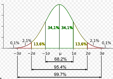
Since the mean is the center value of the normal distribution data set, one-half of the members of the data set are less than the mean, and one-half of the members are greater than the mean. Notice that \(68.2\%\) of the members of the data set are within one standard deviation from the mean. Next, \(95.4\%\) of the members of the data set are within two standard deviations from the mean. Last, \(99.7\%\) of the members of the data set are within three standard deviations from the mean.
Example 1:
Suppose a normal distribution data set has a mean of \(50\), and a standard deviation of \(0.8.\) What percent of the members of the data set are less than \(50.8?\)
Answer: \(84.1\)
Explanation:
First of all, \(50\%\) of the data is below the mean, which is \(50.\) Secondly, \(50.8\) is one standard deviation above the mean, so one-half of the \(68.2\%\) of the data set that is within one standard deviation of the mean is between \(50\) and \(50.8.\) Therefore, \(84.1\%\) of the data set is less than \(50.8.\)
Example 2:
Suppose a normal distribution data set has a mean of \(50\), and a standard deviation of \(0.8.\) What percent of the members of the data set are between \(49.2\) and \(51.6?\)
Answer: \(81.9\)
Explanation:
First of all, \(49.2\%\) is one standard deviation below the mean, which is \(50,\) so one-half of the \(68.2\%\) of the data set that is within one standard deviation of the mean is between \(49.2\) and \(50.\) Secondly, \(51.6\) is two standard deviations above the mean, so one-half of the \(95.4\%\) of the data set that is within two standard deviations above the mean is between \(50\) and \(51.6.\) Add one-half of \(68.2\%\) and one-half of \(95.4\%\). Therefore, \(81.9\%\) of the data set is between \(49.2\%\) and \(51.6\%.\)
All Study Guides for the HiSET Test are now available as downloadable PDFs