Mathematics: Probabilistic and Statistical Reasoning Study Guide for the TSIA2
Page 1
General Information
Both the TSIA2 CRC and Diagnostic Tests contain questions about these areas of math:
- Quantitative Reasoning
- Algebraic Reasoning
- Geometric and Spatial Reasoning
- Probabilistic and Statistical Reasoning
You won’t know if you have to take the Diagnostic test until after you take the CRC, but both tests cover the same skills. It’s best to just prepare as if you’ll need to take both tests.
The CRC has four probabilistic and statistical reasoning questions on it and there are 12 on the Diagnostic Test. All of the probability and statistics concepts are covered in this study guide and you can also use our free practice questions and flashcards to prepare for this and the other three math areas on the tests. Make sure you access additional help for any areas that still give you trouble.
There are only multiple-choice questions on these two math tests.
Counting and Sorting Data
Data is the raw information gathered to investigate a problem or question. Statistics describe characteristics and patterns in the data. Interpretation of these patterns is often guided by principles of probability.
Creating Simple Graphs and Tables
A lengthy list of data is often not useful as it is. The figures need to be presented in some sort of organized manner to be effectively used. Many times, data is organized to form a graph or table.
Tables
A summary of data organized into rows and columns is known as a table. The data are often sorted in ascending or descending order of one of the variables.
Example
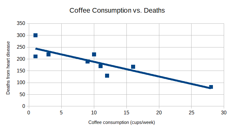
The following is a table showing a number of data points relating weekly coffee consumption in cups to deaths from heart disease.
\[\begin {array}{|c|c|c|c|c|c|c|c|c|c|} \hline \text{Coffee consumption}&1&1&3&9&10&11&12&16&28\\ \hline \text{Heart disease deaths}&211&300&220&190&220&170&130&167&82\\ \hline \end{array}\]Graphs
A graph is a pictorial representation of data and is often easier to read and interpret than a table. There are several major types of graphs and each is best used for certain types of data or to make particular points about the data. Here are a few commonly used types of graphs.
Scatter Plot
A scatter plot is a graph in which each data pair is plotted as a single point. It is good for showing a trend in the data if one exists. The graph below is a scatter plot of the above data table. A scatter plot often shows a trend line that shows the most likely linear trend for the given data. Assuming that these data are reliable, you could conclude that increased consumption of coffee is correlated with a decrease in deaths from heart disease.

Bar Graph
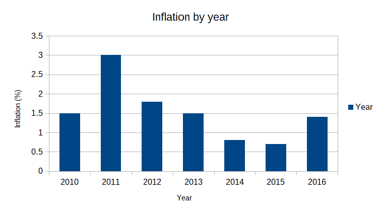
Bar graphs are good for comparison of data in different categories and they are visually simple and quite easy to understand.

Line Graph
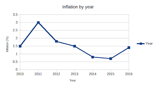
A line graph is very similar to a bar graph in the kind of data shown. Like a bar graph, it is good for showing how data from different categories compare or for indicating trends in the data.

Pie Graph
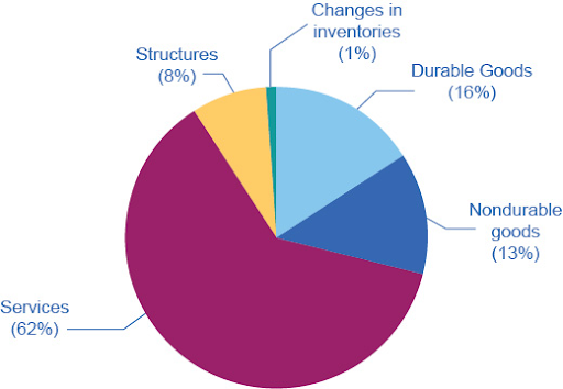
A pie graph uses sectors of a circle to show how a particular whole quantity is divided among several categories, often shown as percentages.

Retrieved from https://openstax.org/books/principles-macroeconomics-ap-courses-2e/pages/5-1-measuring-the-size-of-the-economy-gross-domestic-product
All Study Guides for the TSIA2 are now available as downloadable PDFs