Mathematics Study Guide for the TEAS
Page 4
Data
To facilitate the evaluation and interpretation of data, statistical information is often presented in graphs, charts, tables or diagrams—representations that are useful both in collecting and analyzing data. They are especially helpful in identifying relationships between factors that impact on the outcome of studies and events, such as root causes, associations, and patterns of correlation.
Basic Graphing
The Cartesian coordinate system, also known as the Cartesian plane or the \(xy\)-plane, is commonly shown as a two-dimensional plane with a horizontal x-axis perpendicularly intersected by a vertical \(y\)-axis. The \(x\)-values to the left of the origin are negative, and the \(x\)-values to the right of the origin are positive. The \(y\)-values below the origin are negative, and the \(y\)-values above the origin are positive. The two axes form four quadrants:

Quadrant I contains positive \(x\)-values and positive \(y\)-values: \((+x, +y)\).
Quadrant II contains negative \(x\)-values and positive \(y\)-values: \((-x, +y)\).
Quadrant III contains negative \(x\)-values and negative \(y\)-values: \((-x, -y)\).
Quadrant IV contains positive \(x\)-values and negative \(y\)-values: \((+x, -y)\).
Algebraic functions and geometric shapes can all be shown on the Cartesian coordinate system.

In the graph above, points \(\text{A}\), \(\text{B}\), \(\text{C}\), and \(\text{D}\) are shown in the \(xy\)-plane:
-
Point \(\text{A}\) is located at the origin, which has an \(x\)-value of \(0\) and a \(y\)-value of \(0\) and can be denoted as the ordered pair \((0, 0)\).
-
Point \(\text{B}\) has an \(x\)-value of \(-2\) and a \(y\)-value of \(2\), shown as the ordered pair \((-2, 2)\).
-
Point \(\text{C}\) has an \(x\)-value of \(2\) and a \(y\)-value of \(1\), shown as the ordered pair \((2, 1)\).
-
Point \(\text{D}\) has an \(x\)-value of \(-3\) and a \(y\)-value of \(-3\), shown as the ordered pair \((-3, -3)\).
Reading Tables and Graphs
Data-related questions may include a graph or other visual as part of the stimulus. There are many types of stimuli. Be sure you are familiar with all of these and know how to extract data from them and use it.
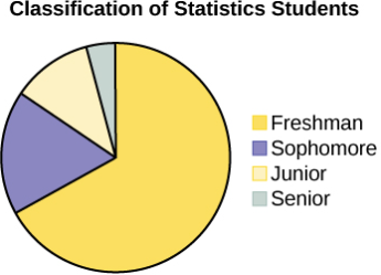
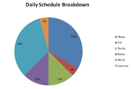
To help you understand what a graph is showing, there is often a legend added to the graph. It is a list of the graph’s features. If the graph has different-colored features, the legend will identify what each color means. In the circle graph below, the legend shows which color belongs to each class. These are known as legend keys.
Sometimes a graph shows several plots, and there will be a legend identifying each one.
Table
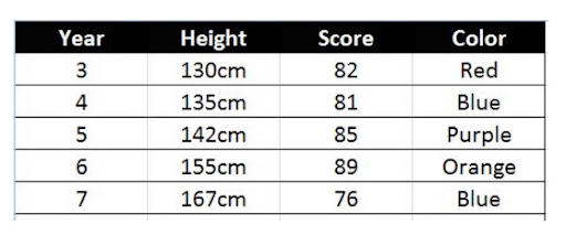
A data table presents information in a series of rows and columns. The first row designates the title of each column and each cell in a column provides data of the title’s type. For example, the chart provided here contains “Year”, “Height”, “Score”, and “Color” as column titles. The second row lists the data associated with Year 2; the third row lists the data associated with Year 3; the fourth row with Year 4, etc.
Line Graph
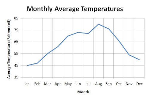
A line graph connects individual data points with lines to show the change between one data point and the next. In the example provided, the average temperatures throughout the year are plotted, showing the change over the course of the year.
It is useful to recognize dependent variables and independent variables, and to be able to differentiate the two. In any experiment, there will be variables under the experimenter’s control, and there will be variables that the experimenter aims to measure. Those variables that the experimenter controls are called the independent variables (so named because they do not depend on the other variables), whereas the changes associated with the dependent variables are those that the experimenter wishes to measure. The independent variable is on the horizontal axis.
In the monthly average temperature graph, the month is the independent variable and the average temperature is the dependent variable, since the temperature depends on the month.
Bar Graph
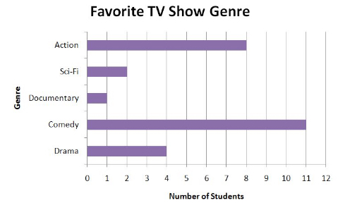
Bar graphs are used to show the relative frequency of different data values or types. The example provided shows how many students favored particular TV show genres.
In some cases, a bar graph will use different colors to represent different types of data. In such cases, a legend will be provided (similar to a map’s legend), that indicates which color(s) are to be associated with which data type(s). Always read every label and title of a graph or chart before attempting to make sense of the data presented. You can find an example of a legend in the “Circle Graph” section.
Histograms are very similar to bar graphs, but rather than show the total number of each data type, the lengths of each bar correspond to the relative frequency of the dependent variable having that particular data value or type while also having the independent variable within a given interval. Consider the following histogram:
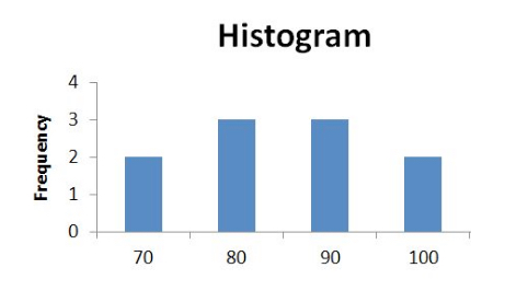
Notice that the vertical axis is labeled “Frequency”. Though using “Frequency” as the label is a common practice, sometimes the name of the variable whose frequency is being recorded will be used instead. For example, if the histogram shown here is displaying the frequency of students’ test scores, the vertical axis could just as well be labeled “Number of Students”. In this case, there are two values in the range 70-79, three values in the range 80-89, three values in the range 90-99, and two values at 100 or greater. These ranges are the intervals into which the entire range of values is divided. Histograms are used to provide easy access to the probabilistic breakdown of a data set.
Circle Graph (Pie Chart)
A circle graph, or pie chart, uses a circle cut into sections to display the relative frequencies of data points. The example provided shows a daily schedule breakdown, in which each daily activity is represented by a percentage of the circle.
Because the overall time period (\(24\) hours) is known and the legend associates each color with an activity, each percentage can be used to determine the amount of time that is spent sleeping, eating, etc. For example, because \(\frac{33}{100} \cdot 24 = 7.92\), the daily schedule includes \(7.92\) hours spent sleeping and working, respectively.
Scatterplot
A scatterplot is another method for representing a bivariate relationship. The example provided shows a relation between hours spent studying and score earned. The data is represented as a collection of plots which can be represented as points on a coordinate plane, for example \((4, 100)\):
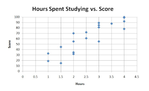
Because the data can be thought of in terms of points on a coordinate plane, a line of best fit can be computed. The line of best fit serves as a predictive function from which future data points can be estimated.
In the plot below, you can see two features:
A line of best fit has been determined and comes quite close to almost all of the points. It would be reasonable to expect that other \(x\) values that have not yet been plotted would also be close to the line.
However, there is a point that lies farther from the line than the others. It is called an outlier. Is it a mistake, or just a surprising, but real, result when \(x=6\)? To tell which, we would have to get deeper into statistics than is required at this level. Just remember what an outlier is.
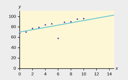
Retrieved from: https://openstax.org/books/introductory-statistics/pages/12-6-outliers
Statistics
Statistics is all about data: collecting, organizing, interpreting, and presenting it. Statisticians have developed methods of doing these things to try to get the best conclusions possible from a set of data. We will take a look at a few of them below.
Measures of Central Tendency
A measurement of central tendency is a single value used to describe a data set. Three common measurements of central tendency are the arithmetic mean or simply mean (also known as the average or, more rarely, the arithmetic average), the median, and the mode.
Mean
By definition, the mean is equal to the sum of a collection of data points divided by the number of total data points. It is the same as the average.
Median
The median is the value that separates the larger half of a data set from the lower half of a data set. It can be thought of as the value in the middle of the data set if the set is listed in ascending or descending order. When the data set contains an even number of data points, the median value is the mean of the two middle values.
Mode
The mode of a data set is the value that occurs most often. If several values share the greatest number of occurrences in a data set, then each value is a mode and thus the data set has multiple modes. This contrasts with the mean and median, of which each data set has exactly one.
Finding These Measures of Central Tendency
Consider the following set of \(12\) data points:
\[-5, \,5, \, 5, \,-1, \, 0, \,1, \, -2, \,4, \,5, \,-2, \,5, \,5\]
To find the central tendency values, we’ll begin by sorting the data in ascending order so the median and mode will be easier to find later:
\[-5, \, -2, \,-2, \, -1, \,0, \,1, \,4, \, 5, \, 5, \,5, \,5, \,5\]To compute the mean, sum the values and divide by the total number of values:
Mean = \(\frac{(-5) + (-2) + (-2) + (-1) + 0 + 1 + 4 + 5 + 5 + 5 + 5 + 5}{12}\)
Mean = \(1.67\) (when rounded to the nearest hundredth)
Because there is an even number of data points, the median is equal to the mean of the two middle values, \(1\) and \(4\):
Median = \(\frac{1+4}{2}\) Median = \(2.5\)
The mode is the value that occurs most often. The value \(5\) shows up most and is, therefore, the mode of the data set.
Measures of Spread
Measures of the spread between values provide additional features with which to quantitatively describe a data set. Some common measures of spread are the range, the variance, and the standard deviation.
Range
The range is the difference between the largest and smallest values in a data set, something like the width of the data set.
Variance
The variance is calculated by taking the differences between each data point and the data set’s mean, squaring the differences, adding them all up, and dividing the result by the total number of data points. It measures how concentrated the data points are.
Standard Deviation
The standard deviation is the square root of the variance. Just like the variance, it measures how concentrated the data points are; we just might find one or the other more convenient for certain calculations.
Finding These Measures of Spread
Let’s return to the data set provided previously:
\(-5, \,-2, \,-2, \,-1, \,0, \, 1, \, 4, \, 5, \,5, \, 5, \,5, \,5\):
The range is the largest value minus the smallest value: \(5 - (-5) = 10\).
The variance is found by first finding the difference between each data point and the mean of the data set, then squaring and summing each difference, and then taking the mean of the squared values:
\(-5 - 1.67 = -6.67\)
\(-2 - 1.67 = -3.67\)
\(-2 - 1.67 = -3.67\)
\(-1 - 1.67 = -2.67\)
\(0 - 1.67 = -1.67\)
\(1 - 1.67 = -0.67\)
\(4 - 1.67 = 2.33\)
\(5 - 1.67 = 3.33\)
\(5 - 1.67 = 3.33\)
\(5 - 1.67 = 3.33\)
\(5 - 1.67 = 3.33\)
\(5 - 1.67 = 3.33\)
Sum of squares of differences:
\[\begin{array}{l} &(-6.67)^2\\ &(-3.67)^2\\ &(-3.67)^2\\ &(-2.67)^2\\ &(-1.67)^2\\ &(-0.67)^2\\ &(2.33)^2\\ &(3.33)^2\\ &(3.33)^2\\ &(3.33)^2\\ &(3.33)^2\\ &(3.33)^2\\ \hline &142.6668\\ \end{array}\]Variance = \(\frac{142.6668}{12} = 11.8889\)
The standard deviation is the square root of the variance: \(\sqrt{11.8889}=3.45\).
Data Shape
When presented graphically, the shape of a data set provides another avenue for data analysis. We can quickly draw conclusions by exploring the way the data is distributed.
Symmetry
Think of a normal distribution:
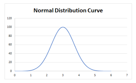
Normal distributions are symmetric, so every data point on the left side is balanced out by its mirror image on the right side, so the mean is right in the middle at the peak. Likewise, for every point to the left of the peak there is one to the right, so the median is at the peak as well. Finally, the mode is the value with the highest number of measurements, i.e. the tallest point, which is again the peak. Thus the mean, the median, and the mode of a normally distributed data set all lie at the central peak.
Modality (Peaks)
The word modality refers to the number of peaks in a distribution curve. The modality can be unimodal, bimodal, trimodal, etc.
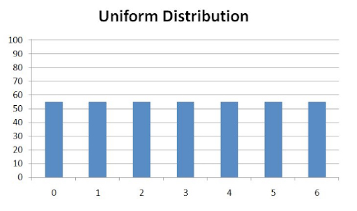
Skewness (Including “Uniform”)
Because a normal distribution contains a single peak, it is also known as unimodal. Normal distributions are special in another regard: they are symmetric because there is a vertical axis of symmetry across the central peak. If the right side of a distribution did not match the left side, the distribution would be called asymmetric.
Other unimodal distributions include left skewed and right skewed:
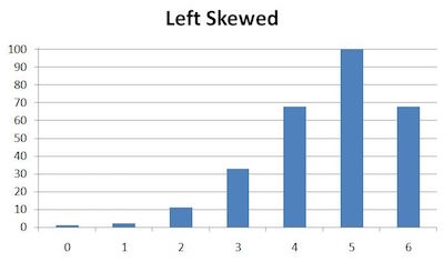
In a distribution skewed to the left, the data is imbalanced and has greater height toward the right side. Any sort of imbalance with a peak toward the right part of the distribution counts as being left skewed. One special case we often see in statistics is when a normal distribution, which is symmetric, has some data points on its right side chopped off as in the example above. That leaves more data on the left side of the peak than the right.
It is important to note that the mean of a left-skewed plot is to the left of the maximum height.
Again, like all shape characteristics of graphs, skewness occurs not only in discrete graphs like bar graphs, which represent data only at specified points (0, 1, 2, 3, 4, 5 and 6 in this example), but also continuous ones with curves.
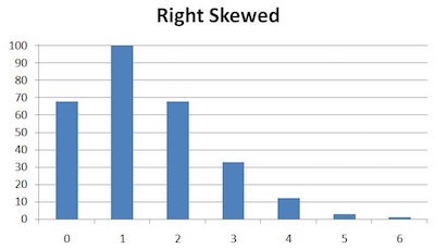
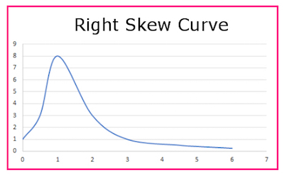
A distribution skewed to the right has the same idea as one skewed to the left; it’s just that the bias is shifted toward the opposite side. A left-skewed graph’s mirror image is a right-skewed graph, and vice versa.
It is important to note that the mean of a right-skewed plot is to the right of the maximum height.
A distribution that contains two peaks is called bimodal:
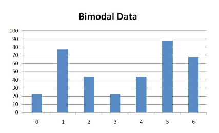
Note that the two peaks in a bimodal distribution need not be of equal height; unequal peaks still qualify a distribution as bimodal.
Finally, a distribution that exhibits the same output value for every input value is called uniform:
Identifying Trends from Data
Quantitatively describing trends in data is an important skill for drawing conclusions about a data set. Complementing graphical representations of data with algebraic representations of data, as well as quantifying the influence of outliers, helps to present a fuller picture of the data.
Variables
Variables are symbols, often letters, that stand for a quantity that is not yet known, which is why variables are also called “unknowns.” The letters \(x\) and \(y\) are widely used. There’s no law against using any letter you want, though generally, letters toward the end of the alphabet are used for variables, and the letters toward the beginning are used for constants.
Dependent Variables
In a relationship, the value of a dependent variable is affected by the value of another variable called the independent variable. See below for more on this.
Independent Variables
The independent variable in a relationship is the variable that is deliberately changed. The dependent variable changes as a result of that. Here’s an example. When you press a car’s accelerator pedal downward, the car’s speed increases. The distance you push the accelerator is the independent variable, since you deliberately changed it and it causes the speed to increase. The speed depends on the accelerator distance, so it’s the dependent variable. To help decide which is the independent variable, try thinking of the opposite relationship. Does the speed of the car cause the accelerator to be pushed down more? Of course not, so speed can’t be the independent variable.
Correlations
Correlation is a measure of how one variable changes in response to the change in a second variable. A high degree of correlation means that the variables are closely related to each other, and a low degree means, of course, that the variables’ relationship is weak. There is a closely related term, covariance, which measures the direction of the relationship between two variables. Correlation goes a step further and gives a measure of the strength of the relationship.
Positive Correlations
A positive correlation is one in which the variables in the relationship change in the same direction. That is, as one increases, so does the other. Keep in mind that a strong positive correlation between variables may hint at a cause-and-effect relationship, but in no way does it prove cause and effect.
Negative Correlations
A negative correlation is one in which the variables in the relationship change in opposite directions. That is, as one increases, the other one decreases.
Relationships
Getting away from statistics now, we’ll take a look at common types of relationships between two sets of values.
Direct Relationships
A direct relationship between two sets of values means the same as a direct proportion between two sets of values. There are two different things to think of here. One is that in general, a direct relationship graph shows a straight line with an upward trend. But not just any upward trend straight line shows a direct relationship. When one of the values is doubled, the other one must be doubled too. Or if one is cut in half, the other value will also be cut in half. We’ve seen this before. If the data are in a direct relationship, the ratio \(\frac{x}{y}\) will be constant. The data table below shows \(x\) and \(y\) in a direct relationship. We know that because \(\frac{x}{y}\) stays constant at \(\frac{1}{6}\).
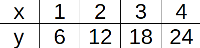
Another tip to know is that the graph of the straight line in a direct relationship passes through the point \((0, 0)\).
Inverse Relationships
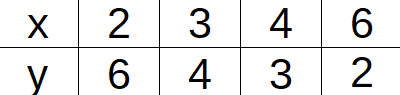
An inverse relationship between two sets of values means the same as an inverse proportion between two sets of values. There are two different things to think of here. One is that in general, an inverse relationship graph shows a curve with a downward trend. But not just any downward trend curve shows an inverse relationship. When one of the values is doubled, the other one will be cut in half. Or, if one is cut in half, the other value will double. We’ve seen this before. If the data are in an inverse relationship, the product \(x \cdot y\) will be constant. The data table below shows \(x\) and \(y\) in an inverse relationship. We know that because \(x \cdot y\) stays constant at \(12\).
Probability
There is a type of probability called theoretical probability. It assumes that in doing something like tossing a coin, the coin is perfectly fair and both possible outcomes, \(T\) or \(H\), are exactly equally likely.
In other cases where we might want to know, or at least estimate, a probability, the situation is too complex to calculate a theoretical probability. In those cases, we can estimate a probability by looking at the data from previous events.
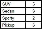
Suppose a car dealership sold \(16\) vehicles over a certain period as shown above. Based on those numbers, what is the probability that the next car sold is a pickup?
Think of each car sale as an event. There were \(16\) such events. How many of these events resulted in the sale of a pickup? That would be \(6\). Based on these numbers, we see that \(6\) out of \(16\) (or \(3\) out of \(8\)) vehicles sold were pickups. We can use that ratio to estimate the probability that if a vehicle is sold, it will be a pickup. That estimated probability is \(\frac{3}{8}\).
All Study Guides for the TEAS are now available as downloadable PDFs