Mathematics Study Guide for the PRAXIS Test
Page 3
Data Interpretation and Representation, Statistics, and Probability
Data interpretation is the way we judge and make sense of data that has been collected. We represent it in different ways to try to find patterns and meaning in a mass of numbers. Statistics is the collection of math techniques that have been developed to interpret and analyze data.
Data Representation
To try to see patterns such as trends, clustering, spread, or central tendency in a set of data, different ways are used to present the data. Common ways to represent data include tables, line graphs, bar graphs, pie graphs, histograms, and stemplots. You should be familiar with extracting information from these representations.
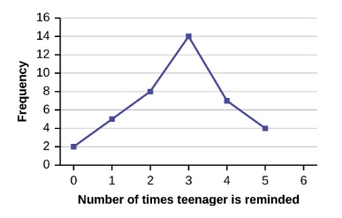
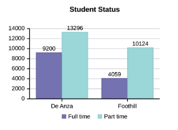

Retrieved from: https://cnx.org/contents/MBiUQmmY@23.33:CY4aJuYS@21/1-2-Data-Sampling-and-Variation-in-Data-and-Sampling
Analyzing Data
Data analysis is the process of inspecting, organizing, and otherwise manipulating data to try to extract some useful information from it. It can be used in business to help make decisions about how best to run companies, and it is used in science to help determine if experimental results are reliable.
Measures of Central Tendency
Sometimes we may want to boil all the data down to just one number that tells us something useful. After a test, teachers are often interested in the class average (the mean) to give them an idea of how the class did as a whole. This mean is located somewhere in the center of the range of scores and is an example of a central tendency, the tendency for the scores to be grouped around some number in the middle of the data set.
Mean
The mean is commonly known as the average of a set of numbers. It’s easy to calculate, just add all the numbers and divide the total by how many numbers there are.
Median
If the data values are arranged in numerical order, the media* is the value that is in the center of the list. The median of \(\{4, \;7, \;11, 18, \;22\}\) is \(11\). If the number of values is even, there is no single number in the center, so find the mean of the two values in the center. The median of \(\{4, \;7, \;11, \;13, \;18, \;22\}\) is \((11+13) \div 2\), which is \(12\).
Mode
The mode is the value that shows up most often in a set of numbers. The mode of \(\{68, \;74, \;81, \;83, \;85, \;85, \;92, \;94, \;98,\; 98, \;98\}\) is \(98\).
Measures of Spread
Data spread sounds exactly like what it is, a measure of how far apart from low to high the data set is. This can be valuable in judging how reliable a data set is. Suppose you have well water that is being measured for lead content, for example, and all the samples measure very close to each other. That narrow spread would give you some confidence that you are getting an accurate result.
Range
The range of a data set is a specific number to show the amount of spread. It’s calculated by subtracting the lowest element of data from the highest. For example, the range of the set \(\{4, \;7, \;11, \;18,\; 22\}\) is \(22-4=18\).
Standard Deviation
Standard deviation is a value that indicates how far data points are from the mean (deviation from the mean). If all the data points are very close to the mean, the standard deviation will be very small. One thing standard deviation is good for is to tell if a set of data is distributed normally around the mean. The graph of a normal distribution is shaped as shown below.
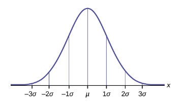
Retrieved from: https://cnx.org/contents/MBiUQmmY@23.33:KgL8DwG_@12/6-1-The-Standard-Normal-Distribution
Drawing Inferences
An inference is a statement made about something that can’t be observed directly. It’s a conclusion based on looking at a portion (sample) of a population and assuming that what you see in that sample applies to the population as a whole. For example, suppose that a wildlife biologist wants to determine how many diseased deer are in the state of Michigan. They randomly trap 400 deer (the sample) around the state and find that 3 of them are diseased. They infer that the ratio \(3\text{:}400\) will hold true for the whole population of \(1,000,000\) deer.
Using a proportion, they calculate the likely number of diseased deer.
Relationships in Scatterplots
Suppose you had six samples of gold and you measured the mass and volume of each. You plot the results and get the graph shown below, called a scatter plot.
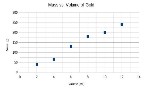
The data do not show a perfectly straight line but do show a generally linear trend upward. We can deduce that there is a positive relationship between mass and volume. As volume increases, so does mass, which fits with our common sense. Pieces of gold with more volume are going to have more mass too.
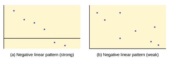
The scatter plots below also show roughly linear trends, but they are downward, showing a negative relationship.
Retrieved from: https://cnx.org/contents/MBiUQmmY@23.33:RIkTUiHP@6/12-2-Scatter-Plots
The plot on the left is actually pretty close to a straight line, so we would be justified in thinking that it truly represents a linear pattern (strong evidence). The plot on the right is a lot more scattered, so we would conclude that the evidence for a linear pattern is much weaker.
Making Predictions
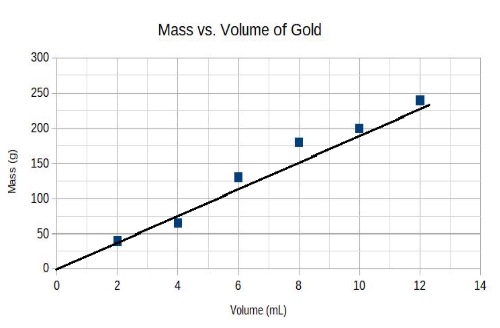
Suppose you are given the scatter plot above and use a ruler to draw a straight line by eye that best fits the data. By best fits, we mean the straight line that comes as close as possible to all the points. (There is a way to more accurately calculate the location of this line, but you won’t need to know it.) You can use the line to determine the mass of any given volume of gold. For example, what is the mass of a piece of gold that has a volume of 8.0 mL? By reading the line graph, you can see that 8.0 mL matches up with 150 g.
Correlation vs. Causation
Year after year, when summer comes and the temperatures go up, so do ice cream sales. We say that temperatures and ice cream sales are correlated. In fact, this is called positive correlation. Both quantities move in the same direction. Would you say that hot weather causes more ice cream to be bought? It seems reasonable.
Another thing that increases in the summer is the murder rate. Ice cream sales go up and murders go up, so they have a positive correlation. Would you say that ice cream sales are a cause of murders? Hardly.
The point of this well-known example is that just because two things are correlated, that doesn’t mean that one causes the other.
Probability
To calculate probability, you need only two things. First, you need to know how many possibilities there are for some event. For example, how many different possibilities are there when you roll a normal die?
The answer is six because the die has exactly six different dot patterns.
Second, you need to know how many possibilities there are to satisfy some requirement. For example, when you roll a die, how many different even numbers can show up? The answer is three: \(2\), \(4\), and \(6\). Let’s call those winners. To get the probability of rolling an even number, divide the number of winners by the total number of possibilities:
Probability = \(\frac{3}{6} = \frac{1}{2}\) or, as a percent, \(50\text{ %}\).
Simple example \(2\): If there are \(3\) red balls, \(7\) green balls, and 8 yellow balls in a sock, what is the probability of randomly pulling out a ball that is not red?
The number of possibilities is \(18\). The number of balls that are not red is \(15\). The probability is \(\frac{15}{18} = \dfrac{5}{6} = 83.3\text{ %}\)
All Study Guides for the PRAXIS Test are now available as downloadable PDFs