Math Study Guide for the SAT Exam
Page 5
More Statistical Terms to Know
Percentage
Percentage is an extension of ratios. The ratio of \(2\) parts to \(5\) parts consisting of the whole, written as \(2\text{:}5\) or \(2/5\), may also be expressed as \(40\%\).
A percentage is solved using this formula:
Percentage = \(\%\) = Part/Whole \(\times 100\%\)
From the example above on the ratio of PSDA questions to the whole SAT exam math section expressed as \(17:58\), we may also say that the PSDA questions make up \(29.31\%\) of the whole SAT exam math section.
Percentage = \(\frac{17}{58} \cdot 100\% = 29.31\%\)
Questions involving percent change (decrease or increase) are commonly seen in SAT math sections. Keep this formula in mind:
Percent change \(= \frac{\text{Final amount} – \text{Initial amount}}{\text{Initial amount}} \cdot 100\%\)
The percent change part on the left side of the formula is in % form and not in decimal form. This is important to remember because this is not always easy to check, especially when the question does not provide information in actual numerals, such as in this example:
\[\text{Percent increase} = \frac{M – F}{F} \cdot 100\%\] \[\frac {3.4 F}{100} = M – F\] \[M = \frac {3.4 F}{100} + F\]The total sales for a brand of soda at a retail store were recorded at \(F\) for the month of February. If the sales increased by \(3.4\%\) in March, what is the expression representing the total sales \(M\) for the month of March?
Concept of Density
Density is the amount of matter (or mass) in a unit volume. For example gold has a density of \(7.92\; \frac {g}{cm^3}\), aluminum has a density of \(2.79 \; \frac {g}{cm^3}\), and water has an approximate density of \(1\; \frac{kg}{L}\).
If the densities of certain objects and substances are known, their mass can be computed given a certain volume, or the other way around.
Scatterplot, Box-and-Whisker Plot, and Histogram
It is important to know how to read graphical representations of data. Three of the types of graphs commonly seen in SAT exams are the scatterplot, box-and-whisker plot, and histogram.
A scatterplot is also referred to as an \(XY\) plot.
A scatterplot is usually the graph type of choice for showing the relationship between bivariate data. The data or values are plotted on the graph as \(x,y\) coordinates with \(x\) as the independent variable and \(y\) as the dependent variable.
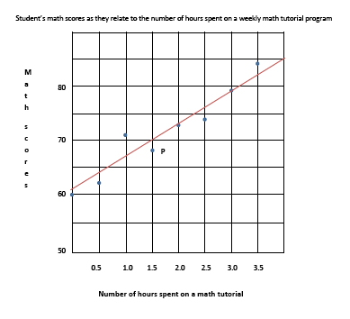
Graph 1: Scatterplot
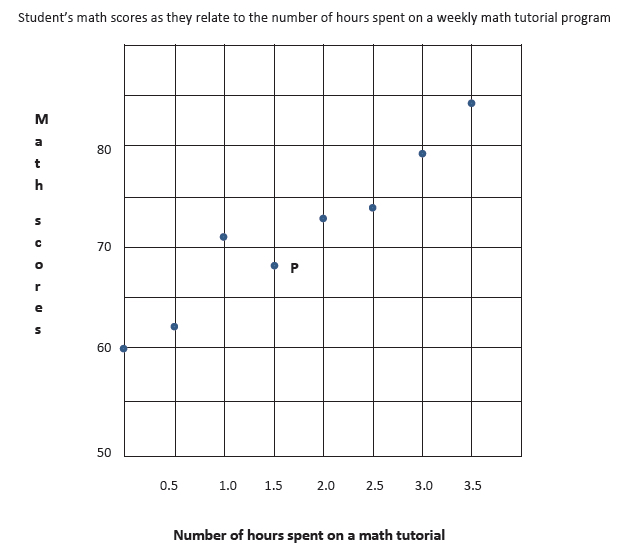
A point in the graph represents two values. For instance, point P represents 1.5 hours of tutorial (the \(x\) value) and a score of \(68\) (the \(y\) value). Viewing the whole scatterplot, we see that as the number of hours spent on the tutorial is increased, the student’s scores increased also. Related topics best-fit line or curve and correlation will be taken up under a separate heading below.
Box-and-Whisker Plot
A box-and-whisker plot may be referred to as a boxplot and is made up of a rectangular box with two horizontal lines on both ends. It looks like this:
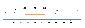
A box-and-whisker plot breaks the data into quartiles. In the graph, the first vertical line represents the first quartile (Q1), the vertical line within the box marks the second quartile (Q2) or the median of the data, and the third vertical line represents the third quartile (Q3). Points \(A\), \(B\), \(C\), and \(D\) are only marked for our purposes. The tip of the horizontal line marked as \(A\) is the smallest value in the data set, while \(B\) on the other tip is the largest value in the data set. There are cases, however, when there are outliers in the data set. These values are represented as dots disconnected from the plot, such as points \(C\) and \(D\).
The median of the data set is \(35\). Without the outliers, the range is \(28 (21 – 49)\). The range describes the spread of all the data. With the outliers, the range will be quite large—around \(50\). You may also determine the interquartile range (IQR), or the range of the middle half of the data. From the plot, the IQR is about \(14\) (Q3 – Q1).
A box-and-whisker plot can be skewed to the right, meaning most of the observations are on the left side, pulling the box to the left, and the longer whisker is stretched to the right. Or it can be skewed to the left, with most of the observations to the right.
Histogram
A histogram is a graph that uses columns or bars on an \(x\)-\(y\) plane to show the distribution of each element in a group of elements. The labels on both the \(x\) and \(y\) axes represent quantitative data, such as the number of athletes in a high school counted according to different height ranges.
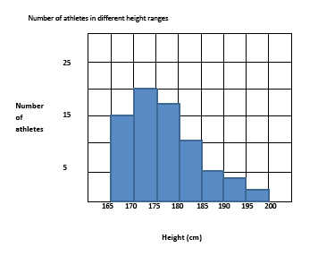
The histogram shows the frequency with which each height range occurs in the data set. It is skewed to the right, which means that most of the athletes are on the shorter end of the scale (\(52\) athletes have height measurements between \(165\) cm and \(180\) cm), with fewer athletes on the taller end.
Please note that on the SAT exam, the range of values in a histogram follows this convention: each bar in the histogram includes the end value on the left and excludes the end value on the right of the range. So a range of \(165-170\) cm includes all values within the range, including \(165\) but excluding \(170\).
A graph showing the number of a school’s athletes (label on the \(y\)-axis) in its basketball, volleyball, soccer, and swimming teams (label on the \(x\)-axis) is a bar graph because it represents categorical data, not quantitative data. Since the labels are categorical, we cannot appropriately refer to a bar graph’s skewness, or to its low or high end. Is there a graph missing? It can seem confusing to talk about a graph that isn’t there.
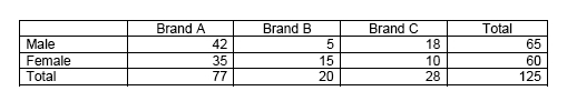
Two-Way Table
Two-way tables are usually used to present survey results in tabular form. The columns show the count or number for one category, while the rows indicate another category. The two-way table below shows the result of a survey conducted on \(125\) college students on the brand of beverage they prefer to drink during lunch break.
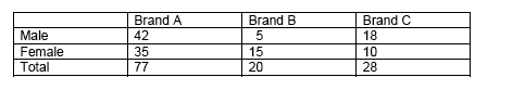
Many questions can be answered by directly finding the correct cell, such as, “Which brand is the least preferred by male students?” The table can also be used to compute answers which may not be readily provided.
Be careful when answering questions that may initially look too simple. You may be asked, “How many students prefer Brand C are female?” Since there are \(28\) students who prefer Brand C and \(60\) students who are female, it is tempting to answer \(88\) right away. However, note that doing so means counting the ten females who prefer Brand C twice. So subtract that number first, and we have the correct answer of \(78\).
Conditional and Relative Frequency; Conditional Probability
The two-way table given above as an example is presented as a frequency table, so-called because it shows the frequency or the count that an event occurs. In the context in which the example was given, the frequency is the number of times that a particular brand of beverage was chosen by the participating students. The numbers in the inner cells are called the frequencies or count.
Table 1: Frequency Table
The numbers are called frequencies, those on the Total column and Total row are called marginal frequencies, and those on the inner cells are called joint frequencies. Looking at the marginal frequencies alone, it would seem that Brand B is the least preferred beverage. Looking at the joint frequencies, however, it is apparent that Brand C is the least favored beverage among females.
This data set can also be shown as a relative frequency table, such as the one below. It shows the frequency of an event occurring relative to the total number of events, hence, the term relative frequency. The relative frequencies or the decimal numbers in the inner cells are called conditional frequencies.
Table 2: Relative frequency Table
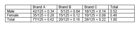
Note: We are showing the division of terms to illustrate the procedure, although relative frequency tables are normally shown with just the resulting decimal numbers.
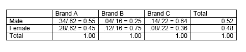
Relative frequencies can be shown for the whole table, such as the one just illustrated. Relative frequencies may also be presented for rows and columns.
Table 3: Relative Frequencies for Rows
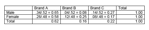
Table 4: Relative Frequencies for Columns
Your understanding of these concepts will usually be tested in the SAT exam, along with the concept of probability.
Here are some probability questions in the format that usually appears in SAT exam questions. The solutions are usually simple, but the questions need a little getting used to.
Question 1:
\[P = 5 \div 125 = 0.04\]Referring to Table 1, what is the probability of randomly selecting a male participant who prefers Brand B?
(Take note that 0.04 is a conditional frequency in Table 2.)
The concept of probability and formulas related to it will be discussed further in its appropriate heading below.
Question 2:
\[P = 5 \div 20 = 0.25\]What is the probability of randomly selecting a male participant, given that the participant prefers Brand B?
(Again, take note that \(0.25\) is a conditional frequency in Table 4)
Question 3:
\[P = 5 \div 65 = 0.08\]What is the probability of randomly selecting a participant who prefers Brand B, given that the participant is male?
(And isn’t this the same conditional frequency in Table 3?)
The conditional frequencies in Table 2 show the probability of a gender preferring a particular brand of beverage.
The conditional frequencies in Table 3 show the probability of each gender preferring a particular brand of beverage, e.g., the probability that male students will prefer Brand A is \(0.65\), while the probability that female students will prefer Brand B is \(0.25\).
The conditional frequencies in Table 4 show the probability of a brand being preferred by a particular gender, e.g., the probability that those who prefer Brand A will be male is \(0.55\), while the probability that those who prefer Brand B will be female is \(0.75\).
Tip: In the test, always be aware that the term “given” in this type of question gives the question a whole new meaning. Also, it will not always be necessary to prepare the relative frequency tables in order to answer questions like the three provided examples. We only wanted to show how the concepts are related.
Line and Curve of Best Fit
From the previous example of a scatterplot, the “line of best fit” can be drawn. It is useful when describing the trend and when making estimates or projections by interpolation or extrapolation. From this line, the best-fit equation or regression equation can then be determined using algebra (straight lines and linear equations).
The equation for the line of best fit, however, will not always be linear. It can take a quadratic or exponential model for its curve of best fit.
We say that there is a high positive correlation between the two variables because as one variable increases, the other also increases.
Questions in SAT often show scatterplots and ask for a description of the correlation of variables. It is therefore important to know the difference between a perfect positive (or negative) correlation, high positive (or negative) correlation, low positive (or negative) correlation, and no correlation.
Linear Growth vs. Exponential Growth
For the set of variables shown in the scatterplot above, their relationship is best modeled by a linear function. Using the points and solving algebraically, we find the slope to be \(+6\) and the linear equation to be:
\[y = 6x + 61\]What is the best interpretation of the slope? What is the best interpretation of the \(y\)-intercept? Questions similar to this will be asked on the SAT exam. The slope suggests that for every increase of \(1\) hour in a math tutorial program, the student’s test score increases by \(6\) points. The \(y\)-intercept indicates that without any tutorial (\(y = 0\)), the student’s score was \(61\).
There is a linear relationship when the difference in values (increase or decrease) is constant. However, when the difference in values is not constant, but the ratio of adjacent values is constant, we refer to the relationship as exponential (growth or decay). Classic examples of this concept are the growth of bacteria, a population increase of rabbits, and compound interest.
The general formula for exponential growth or decay is:
\[y(t) = A \cdot e^{kt}\]where: \(y(t) =\) value at time \(t\)*,
\(A\) = initial value,
\(k\) = rate of growth (if \(k \gt 0\)) or rate of decay (if \(k \lt 0\)),
and
\(t\) = time
This topic is given more depth in the Heart of Algebra section. For the PSDA section, it will be enough to understand the meaning of these concepts in relation to data, such as those given graphically.
Independent and Associated Events
An event is independent if the probability of it happening is not affected by another event. This is often related to the concept of probability. Two events are independent if the probability of each one occurring is not affected by the occurrence of the other.
When a die is thrown, that is an event. Its result is independent of other dice thrown before or after it. In a European roulette wheel, the probability of a number appearing will always be \(1/37\), no matter the number of times the wheel is spun. Each spin is an independent event and not affected by the other spins.
Associated events refer to variables or events that have a relationship or connection. They may also be referred to as correlated variables. Relationships can be causal (one variable causing the change in the other variable), and variables can be quantitative or categorical.
The example on the scatterplot earlier shows associated events—increase in hours for math tutorial and increase in scores. There clearly was an association or a high positive correlation between the two variables in that example.
Population Parameter
A population is a group of entities or events with a common characteristic. It often refers to a group of people, although it may refer to other entities, as well. Examples of a population are:
- all the students in Ocean Springs High School
- all musicians in Oregon
- all subscribers of a daily paper in Maine
A parameter or population parameter is a characteristic of a population expressed using a numerical value. Examples of a population parameter:
- the average height of students in Ocean Springs High School
- the percentage of musicians in Oregon who are self-employed
- the average income of subscribers of a daily paper in Maine
Measurement Error and Margin of Error
When estimating a population parameter based on a sample statistic, it is expected that the resulting estimate will not be the exact, or true, value. What can be expected from a completely randomized sampling, instead, is the closest estimate to the true value. A margin of error is often used to describe the precision of such an estimate.
On the SAT exam, you will not be asked to calculate margins of error. They usually appear as part of the given information and you are expected to understand their implication to the question.
If the sample mean height is computed to be \(121\) cm and the SAT question provides the information that there is a margin of error of \(1.3\) cm, it means that the population’s true mean height falls within the values of \(121 \pm 1.3\).
Here are things to remember about the margin of error:
1) A large margin of error can be decreased by increasing the sample size.
2) The larger the standard deviation, the larger the margin of error.
3) The margin of error applies to the true value of the parameter (e.g., the population mean) for the entire population.
All Study Guides for the SAT Exam are now available as downloadable PDFs